
The complete guide
Website Personalization
What it is, why it works, and where to start.
Learn
Use Cases
How teams use ConversionWax
Guides
Step-by-step setup and strategy
Content Personalization Guide
How to personalize your website
Playbook
Proven plays for every industry
Compare
How we stack up against others
Blog
Personalization tips and platform updates
Help Center
Docs, setup guides, and support
Featured playbook
Ecommerce Personalization Playbook
Geo-targeted offers, BFCM windows, device-specific layouts - copy-paste plays that run themselves.
Optimized Images
Auto-resize for any device
Video Support
Personalized video content
Scheduled Updates
Time-based content automation
By role
Ecommerce Operators
Geo-offers, BFCM, device layouts
Growth Marketers
Campaign pages, UTM matching, A/B
Digital Agencies
Multi-site, version control, team access
New in the platform
AI Image Generation
Generate campaign visuals from a prompt. Saves to your asset library.
Learn more →Real-time personalization hub
Real-Time Website Personalization
One embed across every platform. Geo, UTM, viewport, and schedule rules render in milliseconds.
Platforms
WordPress
Plugin · WordPress.org
Shopify
Real-time personalization
Adobe Commerce
Plugin · Magento personalization
Contentful
Headless CMS personalization
Joomla
Real-time personalization
Sanity
Headless CMS personalization
Native plugins
On WordPress.org
ConversionWax for WordPress
Official plugin: shortcode-based banners, A/B testing, and AI image generation. Defer-loaded, Core Web Vitals friendly.
Get the plugin →Help docs
ConversionWax for Adobe Commerce
Plugin for Adobe Commerce and Magento Open Source. Setup guide and configuration steps.
Read the docs →Asset imports
Just released
Canva → ConversionWax
Import banner designs and hero images from Canva directly into your ConversionWax asset library. Skip the export-upload cycle.
See how it works →Anywhere else
One embed code
If your site can accept a script, ConversionWax works on it. WooCommerce, Webflow, BigCommerce, Squarespace, custom builds.
See setup →How to DIY a CRO audit on your company website

An ecommerce CRO audit is a systematic review of your online store to find where you are losing conversions and why. Not a vague "optimization" exercise - an actual page-by-page inspection of what visitors see, what they do, and where they bail.
Most stores leave this to agencies charging $5,000+ for a deliverable that arrives six weeks later. You can do it yourself in a weekend with free tools, a spreadsheet, and a willingness to look at your own site the way a first-time visitor would.
This guide covers a 7-step ecommerce CRO audit framework. Every step has specific things to check, tools to use, and a clear output. By the end, you will have a prioritized list of fixes ranked by expected impact and implementation effort.
What a CRO Audit Covers
A proper CRO audit touches six areas of your store. Skip any of them and you will miss conversion leaks that are costing you revenue every day.
Landing pages. These are the entry points - your homepage, category pages, any page receiving paid traffic. First impressions happen here. If your above-the-fold content does not immediately communicate relevance, visitors bounce before scrolling.
Product pages. Where purchase decisions happen. Photography quality, description clarity, social proof placement, and CTA visibility all directly affect add-to-cart rate.
Checkout flow. The most expensive place to lose a customer. They have already decided to buy. Every unnecessary form field, confusing layout choice, or missing trust signal between "Add to Cart" and "Order Confirmed" is pure revenue loss.
Mobile experience. Not "is the site responsive" but "is the mobile experience actually good." Tap targets, image sizing, scroll depth, checkout flow on a phone screen. Over 60% of ecommerce traffic is mobile. If your audit only checks desktop, you are auditing the minority experience.
Page speed. Every 100ms of additional load time reduces conversion rate. This is not theoretical - it is measured consistently across industries. Speed affects every other area of the audit because a slow page makes every other element perform worse.
Visual content. Which images actually drive engagement and which are dead weight. Hero banners, product photos, lifestyle imagery, promotional graphics. Most stores have never tested a single image variant. This is where some of the largest conversion gains hide.
The 7-Step Ecommerce CRO Audit Framework
Pull Your Conversion Data Baseline
You cannot measure improvement without a baseline. Before you touch anything on your site, pull these numbers from Google Analytics 4 and document them in a spreadsheet.
Overall store metrics to grab:
- Ecommerce conversion rate (total and by device type)
- Average order value
- Cart abandonment rate
- Revenue per session
- Bounce rate by landing page
Per-page metrics for your top 10 pages by traffic:
- Sessions and unique pageviews
- Bounce rate
- Average engagement time
- Exit rate
- Conversion rate (if the page has a clear conversion action)
Where to find this in GA4: Go to Reports > Monetization > Ecommerce purchases for store-wide metrics. For per-page data, use Reports > Engagement > Pages and screens, then sort by sessions descending. Export the last 90 days as your baseline window - anything shorter and seasonal variation will skew the numbers.
Flag any page that has both high traffic and a below-average conversion rate. These are your highest-opportunity audit targets. A page getting 10,000 monthly sessions with a 1.2% conversion rate when your store average is 2.8% is a bigger opportunity than a page getting 500 sessions with a 0.5% rate.
Audit Landing Page First Impressions
Open each of your high-traffic landing pages in an incognito window. You need to see what a first-time visitor sees, with no cookies, no logged-in state, and no familiarity bias.
Above-the-fold checklist (what loads before scrolling):
- Can you tell what the page is selling within 3 seconds?
- Is the hero image relevant to the product or category? Or is it generic stock photography?
- Is there a clear next action visible without scrolling (shop now, browse category, view product)?
- Does the headline match the traffic source? If people arrive from a Google search for "women's running shoes," does the landing page say "women's running shoes" - or does it say something vague like "gear for every journey"?
Load time check:
- Run each landing page through Google PageSpeed Insights
- Note the Largest Contentful Paint (LCP) score - this is usually your hero image. Under 2.5 seconds is good. Over 4 seconds is actively hurting you
- Check for Cumulative Layout Shift (CLS) - if images load and push content around, visitors lose their place and leave
Visual relevance check:
Screenshot your hero image and show it to someone who has never visited your store. Ask them "what does this company sell?" If they cannot answer correctly, your visual content is failing its primary job. This sounds simple but it catches problems that teams who see their own site daily become blind to.
Review Product Page Elements
Product pages are where money changes hands. Audit your top 5 product pages by revenue - these are the pages where improvement has the highest dollar impact.
Product photography:
- Are images high-resolution and zoomable?
- Do you show the product from multiple angles (front, back, side, detail)?
- Is there at least one lifestyle image showing the product in use?
- Are image backgrounds consistent across products? Mismatched backgrounds signal low quality
- Do images load quickly, or does the gallery cause noticeable lag?
Product description:
- Does the description answer the top 3 questions a buyer would have?
- Is sizing, material, or specification information easy to find?
- Are there bullet points for scannability, or is it one dense paragraph?
Social proof:
- Are customer reviews visible without scrolling past the fold?
- Is the review count displayed near the product title?
- Do reviews include photos from customers?
- If you have few reviews, are you showing other trust signals (guarantees, certifications, press mentions)?
Add-to-cart area:
- Is the Add to Cart button visually prominent? Can you find it in under 2 seconds?
- Is the price clearly displayed next to the CTA?
- Is shipping cost mentioned (even "free shipping over $X") near the purchase area?
- Does the button stay sticky on mobile as you scroll?
Document each issue you find with a screenshot and the specific page URL. Vague notes like "product page needs work" are useless a week later. Write "Product X page - review section buried below 3 scrolls of description, move above fold."
Walk Through Checkout
Add a product to your cart and go through your entire checkout process as if you are a customer. Do this on both desktop and mobile. Time how long it takes. Count the number of form fields. Note every moment of friction.
Cart page:
- Can the customer clearly see what is in their cart (product name, image, quantity, price)?
- Is it easy to update quantity or remove items?
- Are shipping costs shown, or does the customer not find out until later? Surprise costs at checkout are the #1 reason for cart abandonment
- Is there a promo code field? If yes, is it collapsed by default? An open promo field sends customers off-site to hunt for codes
Form fields:
- Count every field. Each additional field reduces completion rate by roughly 3-5%
- Are you asking for anything you do not strictly need? Company name, phone number, "how did you hear about us" - every optional field that looks required costs conversions
- Does the address field auto-complete? If not, you are adding 30+ seconds of typing
- Is guest checkout available, or do you force account creation?
Payment and trust:
- How many payment options do you offer? At minimum: credit card, PayPal, and one mobile wallet (Apple Pay or Google Pay)
- Are security badges visible near the payment form?
- Is your return/refund policy linked from the checkout page?
- Does the SSL certificate display properly?
Cross-reference your findings with your cart abandonment data from GA4. If you see a big drop-off at the shipping info step, and your audit reveals that shipping costs are not shown until that step, you have found a direct cause-and-effect relationship.
Test Mobile Experience Separately
Do not just resize your browser window. Use an actual phone. Better yet, use two phones - one iOS, one Android. The experience is different, and that is the point.
Navigation:
- Does the hamburger menu open smoothly?
- Can you reach the search function in one tap?
- Are category links accessible without excessive drilling?
- Can you get back to the homepage from any page?
Tap targets:
- Are buttons at least 44x44 pixels? Anything smaller and fat-finger taps hit the wrong thing
- Is there enough spacing between clickable elements?
- Do dropdown menus work properly on touch?
Images on mobile:
- Are hero images cropped for mobile, or are they the same wide desktop banners squeezed into a phone screen?
- Do product images fill the viewport vertically? On mobile, a small product image floating in a sea of white space looks unfinished
- Can you pinch-to-zoom on product photos?
- Are images served in mobile-appropriate sizes? A 2000px-wide hero loading on a 390px-wide phone is wasting bandwidth and slowing the page
Mobile checkout:
- Does the keyboard type match the field? (Number pad for phone, email keyboard for email)
- Do form fields auto-advance after completion?
- Is the purchase button visible without scrolling past the order summary?
- Can you complete checkout with Apple Pay or Google Pay in two taps?
Compare your mobile conversion rate against desktop in GA4. If mobile converts at less than half the desktop rate, mobile UX is almost certainly the problem - not traffic quality. The visitors are the same people on different devices.
Audit Visual Content Performance
This is the step most CRO audits skip entirely, and it is often where the highest-value wins are hiding. Visual content - hero banners, product photography, promotional graphics - is usually chosen based on internal opinion rather than performance data. "The team liked this one" is not a conversion optimization strategy.
What to evaluate:
- Inventory every hero image and promotional banner across your top 10 pages
- Note which images have been there for more than 90 days without being tested or changed
- Identify images that serve all visitors identically regardless of context (location, time of day, viewport size, traffic source)
- Check if your hero images match the intent of each traffic source. A visitor from a Google Shopping ad for "blue running shoes" who lands on a generic lifestyle banner has a mismatched visual experience
How to test image performance:
This is where a tool like ConversionWax fits into the audit. Instead of guessing which hero image performs better, you set up a direct A/B test between image variants and let traffic data decide.
- A/B test hero images. Upload two variants of your homepage hero. ConversionWax automatically splits traffic between them and tracks clicks and renders for each. Run for 14 days or until you hit statistical significance
- Test by viewport. Upload separate image variants for desktop, tablet, and mobile. A wide landscape banner might perform well on desktop but lose engagement on a phone where it renders too small to read. ConversionWax responsive variants let you serve different images per breakpoint and track each independently
- Test geo-targeted imagery. If you have customers across multiple regions, test whether location-specific imagery outperforms your default. Show a desert landscape hero to Arizona visitors and a forest trail to Pacific Northwest visitors. Compare click-through rates per region against your one-size-fits-all default
- Match ad creative to landing page imagery. Use URL variable rules to swap your hero image based on the UTM campaign parameter. When your Facebook ad shows a specific product photo, the landing page should show that same image above the fold - not a different one that breaks visual continuity
Metrics to track per image:
- Click-through rate (clicks / renders)
- Renders per page load (are images actually appearing before visitors leave?)
- Downstream conversion rate (did visitors who saw Image A convert at a higher rate than Image B?)
- Performance by device type - desktop, tablet, and mobile metrics side by side
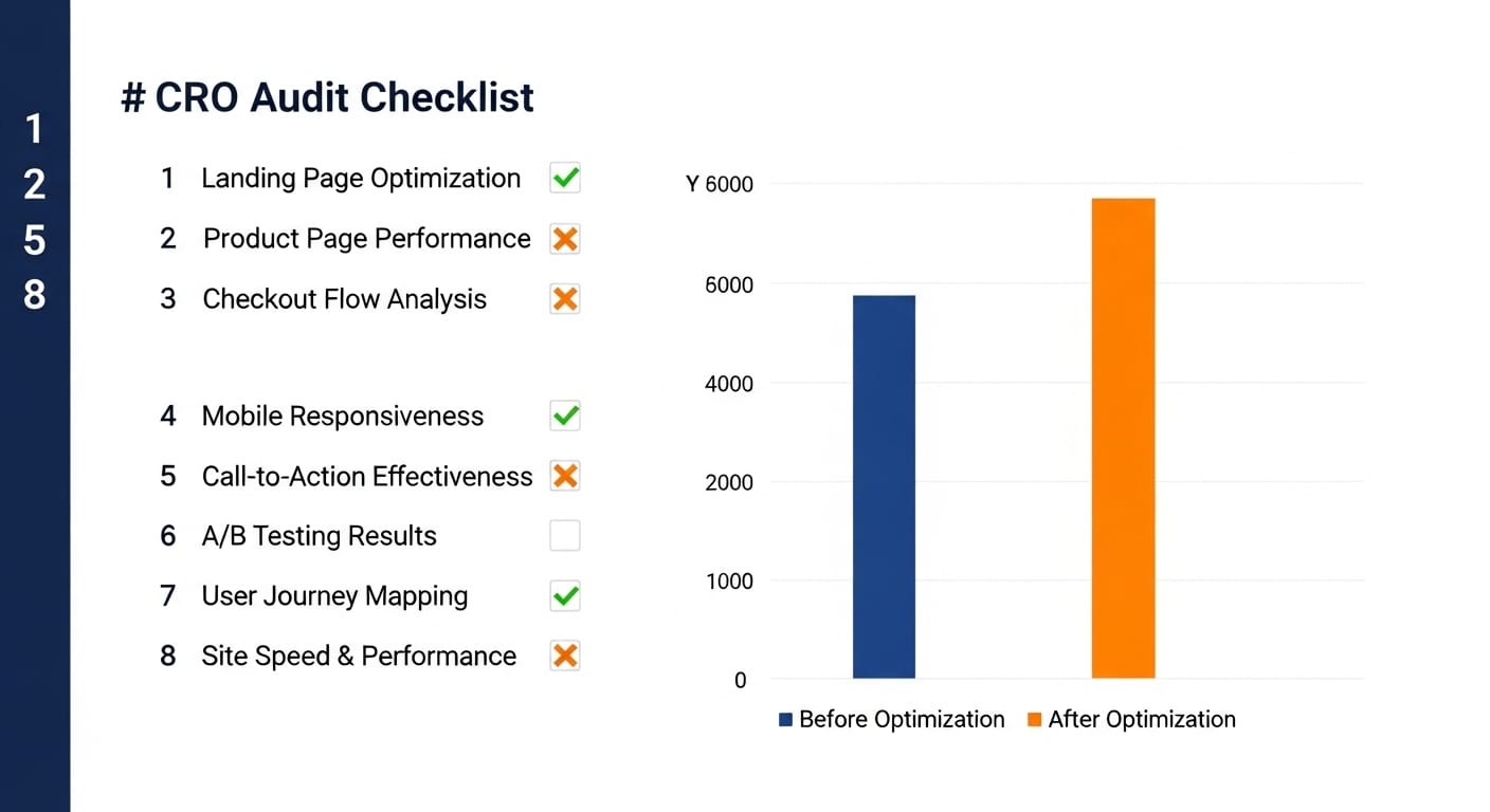
Stores that start testing their visual content typically find 8-35% conversion improvements on the pages where they run image A/B tests. The reason the range is wide is that some stores are already close to optimal while others have been showing the same untested hero image for two years.
Prioritize Fixes by Impact vs Effort
By now your spreadsheet has dozens of issues. Fixing all of them at once is not realistic. You need a prioritization framework that focuses your first round of changes on the highest-return items.
Rate every issue on two axes:
- Expected impact (1-5): How much will fixing this move the conversion needle? A checkout friction fix on a page with 50,000 monthly sessions is a 5. A footer link color change is a 1
- Implementation effort (1-5): How hard is this to fix? Changing a hero image is a 1. Rebuilding your checkout flow is a 5
Sort your fixes into four buckets:
- Quick wins (high impact, low effort) - Do these first. Image swaps, CTA button changes, trust badge additions, mobile tap target fixes
- Major projects (high impact, high effort) - Plan these for your next sprint. Checkout redesign, mobile navigation overhaul, page speed optimization
- Fill-ins (low impact, low effort) - Do these when you have spare cycles. Copy tweaks, minor layout adjustments
- Deprioritize (low impact, high effort) - Skip these unless nothing else is left
This is the standard 2x2 prioritization matrix. It works because it forces you to be honest about what actually moves revenue versus what just feels like it should be important.
Building Your Fix Roadmap
With your prioritized list in hand, build a 30-60-90 day roadmap.
Days 1-30: Quick wins only. Focus on changes that take less than a day each and touch your highest-traffic pages. Typical first-month fixes include:
- Swap generic hero images for product-relevant or audience-relevant variants
- Set up A/B tests on your top 3 landing page hero images
- Add trust badges to checkout
- Fix mobile tap target issues
- Enable guest checkout if currently disabled
- Compress and properly size images that are slowing page load
Days 31-60: Data-driven iteration. Review the results of your quick wins. Your image A/B tests should have clear winners by now. Roll winning variants to 100% of traffic and start the next round of tests. This is also when you tackle medium-effort items:
- Implement viewport-specific imagery (different images for mobile vs desktop)
- Add geo-targeted image variants for your top geographic markets
- Reduce checkout form fields
- Restructure product pages based on audit findings
Days 61-90: Systematic expansion. Take what worked on your top pages and apply it across the site. Build processes for ongoing testing so the CRO audit is not a one-time event but a repeating cycle.
Tools You Need (and What They Cost)
You can run this entire audit with mostly free tools.
- Google Analytics 4 (free) - Conversion data, traffic analysis, funnel visualization
- Google PageSpeed Insights (free) - Load time and Core Web Vitals
- Google Search Console (free) - Mobile usability issues, page experience signals
- A spreadsheet (free) - Your audit tracker and prioritization matrix
- ConversionWax (free plan available, paid from $19/month) - Image A/B testing, viewport-specific image serving, geo-targeted imagery, click and render analytics
You do not need a heatmap tool for the initial audit. Heatmaps are useful for diagnosing specific interaction problems after you have identified which pages underperform, but they are not necessary for the framework above. Start with the free tools, add specialized tools as your testing program matures.
Common Mistakes That Waste CRO Audit Time
Auditing everything at once. Start with your top 10 pages by revenue. You cannot fix 200 pages simultaneously, and the Pareto principle applies hard here - 80% of your conversion problems are on 20% of your pages.
Skipping the baseline. If you do not record your current metrics before making changes, you cannot prove anything improved. "The site feels better" is not a metric.
Treating mobile as a checkbox. "The site is responsive" is not the same as "the mobile experience is good." Test on real devices, with real thumbs, on a real cellular connection.
Ignoring visual content. Teams will spend weeks optimizing button colors and copy while the same untested hero image has been running for a year. Image testing often produces larger conversion lifts than text changes because visuals are processed faster and trigger emotional responses before the rational brain engages.
Making changes without testing. An audit identifies problems. A/B testing confirms solutions. Do not redesign your product page based on audit findings alone. Test the changes against the current version and let the data confirm the improvement.
Start Testing Your Visual Content
Set up your first image A/B test in under 10 minutes. Free plan includes 5,000 monthly pageviews.
Running the Audit on a Schedule
A CRO audit is not a one-time project. Run the full framework quarterly. Between full audits, keep a running list of issues as you notice them in your analytics data. The quarterly cadence works because it gives you enough time to implement fixes, gather test data, and see measurable impact before the next round.
Each quarter, start by reviewing the previous quarter's baseline against current numbers. Document what improved, what did not, and what new problems surfaced. This creates a compounding improvement cycle where each audit builds on the last.
For visual content specifically, keep image tests running continuously. When one test concludes, start the next. The stores that see the largest sustained conversion improvements are the ones that treat image testing as an ongoing program rather than a one-off experiment.
Start Your Audit This Weekend
You now have the full framework. Open GA4, pull your baseline numbers, and start working through the steps on your highest-traffic pages. The audit itself takes a day or two. The roadmap that comes out of it will drive conversion improvements for the next quarter.
For the visual content audit specifically, start a free ConversionWax trial and set up your first hero image A/B test. You will have performance data within two weeks that tells you exactly which image variant drives more clicks and conversions.