Most CRO advice is theory. "Optimize your funnel." "Reduce friction." "Test everything." Helpful in the abstract, useless when you are sitting in front of your analytics trying to figure out what to fix first.
This is a CRO checklist you can actually run through in an afternoon. It is not a course, not a framework, not a philosophy. It is 40+ specific items grouped by page type. Open your site in one tab, open this list in another, and start checking things off. By the end, you will have a prioritized list of changes ranked by likely impact and effort.
The items here are drawn from audits across ecommerce stores, SaaS platforms, service businesses, and lead gen sites. These are not generic CRO recommendations recycled from a textbook - they are specific checks based on what actually moves conversion rates in practice. Not every item applies to every site, but most of them apply to most sites. Skip what does not fit. Focus on what does.
Pre-Audit Setup Checklist
Before you start evaluating pages, confirm you have the tools and access to actually measure what you find. Auditing without measurement is just opinion.
Google Analytics (or equivalent) access confirmed. You need at least 30 days of data. Check that your conversion events are firing correctly - add-to-cart, form submit, purchase, signup. If goals are not configured, your audit has no baseline. Run a test conversion yourself and verify it appears in real-time reports.
Baseline conversion rate documented. Write down your current sitewide conversion rate, plus rates for your top three traffic sources and your top five landing pages. You cannot prove improvement without a starting number. Screenshot it. Put it in a spreadsheet. This is your "before" measurement.
Heatmap tool installed and collecting data. Tools like Hotjar, Microsoft Clarity, or Lucky Orange show you where people click, how far they scroll, and what they ignore. Install one at least a week before your audit so you have real behavioral data. Click maps on your landing pages are worth more than ten hours of guessing.
Session recordings enabled. Watch five to ten recordings of real visitors navigating your site. Pay attention to hesitation (cursor hovering without clicking), rage clicks (repeatedly clicking something that is not a link), and abandonment points. This takes 20 minutes and will rewrite your assumptions about how people use your site.
Test account with a fresh browser profile. Create a test account on your own site (or use incognito mode) so you can walk through every flow as a new visitor. Clear cookies, disable ad blockers, and use your phone as well as your laptop. You need to see what a real first-time visitor sees, not the cached version you are used to.
Landing Page CRO Checklist
Landing pages are where traffic meets intent. Whether someone arrives from a Google ad, an email campaign, or organic search, the landing page has about five seconds to answer one question: "Am I in the right place?" Here is what to check.
Headline matches visitor intent within 5 seconds. Read your headline out loud. Does it tell someone what you do, who you do it for, and why it matters? If you need a subheadline to explain the headline, the headline is not working. Compare it to the ad copy or search query that sent traffic to this page. Message match between the ad and the landing page is one of the biggest single levers for conversion.
Hero image is relevant, not decorative. Stock photos of smiling businesspeople shaking hands do not convert. Your hero image should show the product in use, the end result, or something that directly supports the headline. If you removed the hero image entirely and nothing felt missing, it was decorative. Replace it with something that carries information.
Primary CTA visible without scrolling. Your main call-to-action should be above the fold on both desktop and mobile. Check this on a real phone, not just a responsive preview. If users have to scroll to find the button, some percentage of them never will. Use a contrasting color that does not appear elsewhere on the page so the button is visually distinct.
Page loads in under 3 seconds. Run your landing page through
Google PageSpeed Insights. Every second of load time past 3 seconds costs you roughly 7% of conversions. Check both mobile and desktop scores. Common culprits: uncompressed images, render-blocking JavaScript, too many third-party scripts. Fix the biggest offender first.
Mobile layout is not a shrunken desktop. Pull up your landing page on your phone. Is the text readable without zooming? Are buttons large enough to tap without accidentally hitting something else? Does the layout flow vertically in a way that makes sense, or are two-column desktop sections stacking awkwardly? Mobile visitors are often 50% or more of your traffic. Their experience deserves its own review.
Social proof placed near the conversion point. Testimonials, review counts, client logos, and trust badges work hardest when they appear close to where the user makes a decision. A testimonial at the top of the page is good for trust. A testimonial right next to the CTA button is better for conversion. Check your scroll depth data to see where most users stop scrolling, and put proof there.
Value proposition is above the fold, not buried. Visitors should not have to scroll to understand what you are selling and why it matters to them. Your value prop is not the same as your headline. The headline grabs attention; the value prop closes the loop: "Here is the specific benefit you get." If yours lives below two screens of feature descriptions, move it up.
Form fields are the minimum viable set. Count the fields on your lead gen form. Now ask: which of these do I absolutely need to route this lead? Name and email might be enough. Every additional field drops completion rate by roughly 5-10%. If you are asking for phone number, company size, budget range, and "how did you hear about us" all on the first form, you are filtering out people who would have converted with less friction.
One page, one goal. Landing pages with multiple competing CTAs ("Buy now," "Schedule a demo," "Download the whitepaper," "Follow us on social") dilute focus. Each landing page should have one primary action. Secondary navigation and footer links are fine, but the page should guide the eye toward a single conversion event. If your heatmap shows clicks scattered across six different elements, the page is doing too many things.
Exit intent or scroll-triggered CTA for non-converters. Not everyone converts on the first scroll. A subtle exit-intent popup or a sticky bottom bar that appears after 50% scroll depth gives visitors a second chance without being aggressive. The key word is subtle. Full-screen popups that block content within three seconds of landing will increase your bounce rate, not your conversion rate.
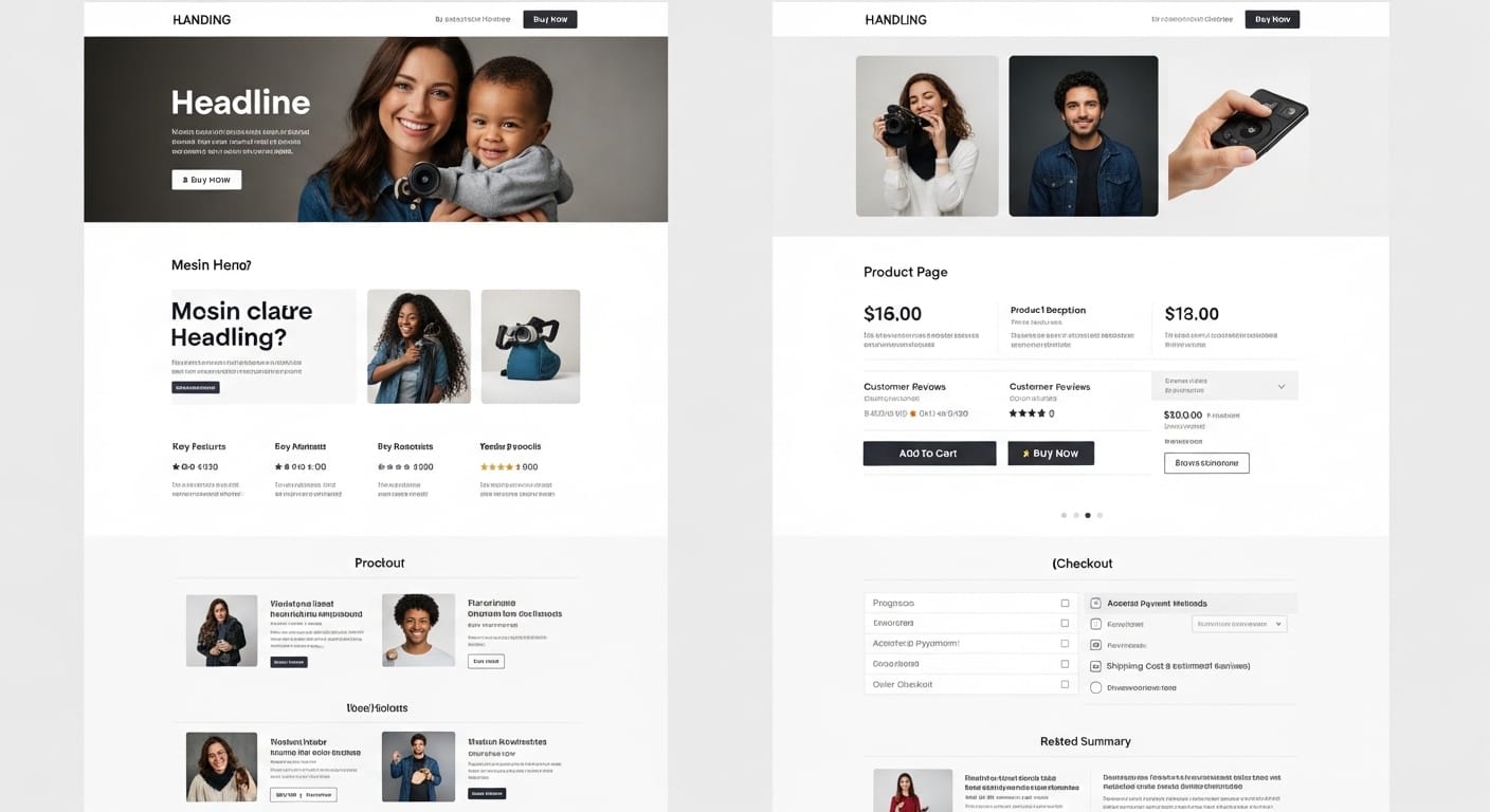
Product Page Checklist
Product pages are where purchase intent meets execution. A visitor on a product page has already expressed interest. Your job is to not get in the way, and to answer the questions that stand between browsing and buying.
Product images are high quality with multiple angles. The primary product photo should be clear, well-lit, and large enough to see detail. Include at least three angles: front, side or back, and a lifestyle shot showing the product in context. For clothing, show it on a model. For software, show a real screenshot. If your images are low resolution or limited to a single angle, visitors cannot build enough confidence to buy.
Price is immediately visible, not hidden behind a click. If visitors have to click "See pricing" or add to cart just to find the price, you are adding friction at the worst possible moment. The price should be visible on the product page itself, ideally near the product title. If you offer discounts, show the original price struck through next to the sale price so the value is obvious.
Add-to-cart button is prominent and always reachable. The buy button should be the most visually dominant element on the page. Use a contrasting color, make it full width on mobile, and consider making it sticky so it follows the user as they scroll through product details. If someone has to scroll back up to find the button after reading reviews, that is a conversion leak.
Reviews and ratings are present and authentic. Product pages with reviews convert 270% more than those without (Spiegel Research Center). Display your star rating prominently. Show the review count. Let visitors filter reviews by rating. If you do not have reviews yet, add a post-purchase email sequence to collect them. Avoid removing negative reviews entirely - a mix of 4- and 5-star reviews looks more credible than a wall of perfect scores.
Size/variant selector works without confusion. If your product has variants (size, color, material), the selector should update the product image, price, and availability in real time. Nothing kills confidence faster than selecting "Large, Blue" and wondering if the image you are looking at reflects that choice. Test every variant combination yourself and confirm the page updates correctly.
Shipping info is visible before checkout. "How much is shipping?" and "When will it arrive?" are the two questions that most frequently cause cart abandonment. Answer them on the product page, not after someone enters their address at checkout. If you offer free shipping over a threshold, display that prominently. If delivery times vary by location, show an estimate based on the visitor's region.
Mobile zoom and swipe work properly. On mobile, visitors should be able to pinch-to-zoom on product images and swipe between photos. Test this on an actual phone. If the zoom does not work, or if swiping between images accidentally triggers page navigation, the mobile experience is broken. Nearly half of ecommerce traffic is mobile, and broken image interaction is a direct conversion blocker.
Related products and cross-sells are present. "Customers also bought" and "Frequently bought together" sections serve two purposes: they increase average order value, and they keep visitors on your site instead of bouncing back to search results. Place these below the main product details but above the footer. Make sure the recommendations are actually relevant - showing random products erodes trust.
Return policy and guarantees are easy to find. A visible return policy reduces purchase anxiety. Link it from the product page, not just the footer. "Free returns within 30 days" next to the add-to-cart button can measurably increase conversion. If your policy is generous, feature it prominently - it is a competitive advantage, not a legal footnote.
Checkout Checklist
The average cart abandonment rate is around 70% (Baymard Institute). Most of that abandonment happens at checkout. The visitor already decided to buy. Your checkout process talked them out of it. Here is what to fix.
Guest checkout is available. Forcing account creation before purchase is one of the top reasons for cart abandonment. Let people buy without creating an account. You can ask them to create one after the purchase, on the confirmation page, when they are already committed. "Save your details for next time?" converts much better than "Create an account to continue."
Progress indicator shows where the user is. Multi-step checkouts should show a progress bar: Shipping > Payment > Confirmation. Without it, users feel like the process might go on forever. Even a simple "Step 2 of 3" reduces anxiety and drop-off. If your checkout is a single long page, consider breaking it into steps - long forms feel more intimidating than short sequential ones.
Multiple payment methods are offered. Credit card is baseline. Add Apple Pay, Google Pay, PayPal, and Shop Pay at minimum. Each additional payment method removes a subset of objections. Some visitors will not complete a purchase if they have to get up to find their wallet. Mobile wallets that autocomplete payment with a fingerprint can double mobile checkout completion rates.
Trust badges and security indicators are visible. SSL padlock, PCI compliance badges, payment processor logos, and "Secure checkout" messaging near the payment form reduce anxiety. These do not need to be large, but they need to be present. Visitors are entering credit card numbers. Give them visual confirmation that the page is secure.
Error messages are specific and inline. "There was an error" is useless. "Please enter a valid zip code" next to the zip code field is helpful. Validate fields as the user fills them in, not after they hit submit. Highlight the problem field in red and explain what is wrong. Generic error banners at the top of the page that require scrolling up to see are a common reason users give up at checkout.
Mobile keyboard types match the input field. When a user taps the phone number field on mobile, the numeric keypad should appear. Email fields should show the keyboard with the @ symbol. Zip code fields should show numbers. This is a small detail that significantly reduces friction on mobile. Check every field in your checkout on a real phone and confirm the correct keyboard appears.
Cart summary stays visible throughout checkout. Visitors want to see what they are buying and the total cost at every step. If the cart summary disappears when they move to the payment step, it creates uncertainty. A sticky sidebar on desktop and a collapsible summary on mobile keep the order details accessible without taking over the screen.
No surprise costs at the final step. The number one reason for cart abandonment is unexpected extra costs (shipping, taxes, fees) that appear at checkout. Show the total cost, including estimated shipping and tax, as early as possible. If you can display "Estimated total: $47.99 including shipping" on the cart page before checkout even begins, do it.
Visual Content and Personalization CRO Checklist
This section covers a layer most CRO checklists skip entirely: whether your visual content is doing its job, and whether you are using personalization to make it work harder. Generic images shown to every visitor leave performance on the table. Testing and personalizing visual content is where mature CRO programs find their next round of gains.
Image A/B testing is set up on high-traffic pages. Most teams A/B test headlines and button colors but never test the hero image. Visual content is often the largest element on the page and the first thing visitors process. Set up
image A/B testing on your top three landing pages. Run a lifestyle photo against a product shot, or a person-focused image against a result-focused image. The winner might surprise you, and the conversion difference can be significant.
Geo-targeted hero image variants are in place for top markets. A visitor in Toronto and a visitor in Phoenix have different visual associations, different seasons, different contexts.
Location-based image personalization lets you serve regionally relevant visuals without creating separate landing pages. Start with your top two or three markets by traffic volume. Show city-relevant imagery, climate-appropriate product photos, or regional lifestyle photography. This is not about tricking anyone - it is about making the page feel relevant to where the visitor actually is.
Viewport-specific images uploaded for desktop, tablet, and mobile. A wide panoramic hero image that looks impressive on a 27-inch monitor becomes an unreadable stripe on a phone. Upload separate image assets optimized for each viewport: landscape for desktop, tighter crops for tablet, vertical compositions for mobile. This is not responsive scaling - it is intentionally different images designed for how each viewport size is used.
Platforms like ConversionWax let you define custom breakpoints per banner so you control exactly when the swap happens.
Banner click tracking is enabled and reviewed. Every visual element that links somewhere should have click tracking. This is not about vanity metrics. It is about understanding which images drive action and which are ignored. If your hero banner gets 10,000 impressions and 12 clicks, the image is not compelling enough to drive engagement. Compare click rates across image variants to find what actually resonates.
Version control on visual content changes. When you update a hero image or swap a product photo, can you revert it if the change hurts performance? Visual content should have version history just like code does. Track what changed, when it changed, and what the performance was before and after. If you are making visual updates by uploading over the same filename, you have no rollback and no audit trail.
Display scheduling configured for time-sensitive promotions. If you run seasonal sales, flash promotions, or event-based campaigns, your promotional visuals should swap automatically based on a schedule rather than requiring someone to manually update the site at midnight. Set start and end dates for promotional banners so they go live and expire on time, every time. Manual swaps introduce human error and timezone mistakes.
Campaign-matched visuals for paid traffic sources. When someone clicks a Facebook ad featuring a specific product image and lands on a page with a completely different hero image, the disconnect breaks trust. Use UTM parameters to match landing page visuals to the creative that brought the visitor there. The ad shows a red jacket, the landing page shows the same red jacket. Simple alignment, measurable impact on conversion.
Image file sizes are optimized without quality loss. Large image files slow down page loads, and slow pages kill conversions. Compress images to WebP format where browser support exists. Lazy-load images below the fold. For hero images and product photos above the fold, prioritize loading them first. A 3MB hero image on a mobile connection adds seconds of load time that directly translate to lost revenue.
Post-Audit: The Prioritization Framework
You have now walked through 40+ items. Some will have passed. Others will have gaps. The temptation is to fix everything at once. Do not do that. Fixing everything at once means nothing gets measured properly, and you cannot isolate what actually moved the needle.
Use a simple impact-versus-effort matrix to prioritize what to tackle first.
Quick Wins (Do First)
High impact, low effort. Examples: fixing mobile keyboard types, adding trust badges to checkout, making the CTA button more visible, enabling guest checkout. These can often be done in a day and produce measurable results within a week.
Strategic Projects (Plan Next)
High impact, higher effort. Examples: setting up image A/B testing across pages, implementing geo-targeted visuals for top markets, redesigning the checkout flow, adding a full review system to product pages. Worth doing, but budget a sprint for each.
Fill-Ins (Batch Together)
Low impact, low effort. Examples: updating alt text on images, adjusting button colors, rewording secondary CTAs. Not urgent, but worth batching into a single cleanup session when you have a slow afternoon.
Deprioritize (Maybe Later)
Low impact, high effort. Examples: full site redesigns without data justifying them, building custom personalization engines from scratch, migrating platforms for minor UX improvements. If the ROI math does not work, park it.
Take your audit results, drop each item into one of these four quadrants, and work through them in order. Start with Quick Wins, then schedule Strategic Projects into your roadmap.
A practical scoring approach
For each failed checklist item, score two things on a 1-5 scale:
- Estimated conversion impact (1-5): How much could fixing this move the conversion rate? A broken checkout flow is a 5. A slightly suboptimal button color is a 1.
- Implementation effort (1-5): How much time and resources does the fix require? Adding a trust badge is a 1. Rebuilding your checkout is a 5.
Divide impact by effort for a simple priority score. Items with the highest score get done first. This keeps your team focused on work that actually moves revenue, not on whatever happens to be easiest or most visible.
Putting It Into Practice
A CRO checklist is only useful if you actually run through it. Block an afternoon. Open your site in a fresh browser. Open this list. Go page by page, item by item. Document what passes and what fails. Score the failures. Build a priority list. Start with the quick wins.
Then, and this is the part most teams skip, come back and do it again in 90 days. Conversion optimization is not a one-time project. It is a recurring practice. Your site changes, your traffic mix shifts, your competitors evolve. The checklist items stay the same, but the results of each audit will be different.
If your audit surfaces gaps in visual content, specifically around testing image variants, personalizing visuals by location or viewport, or scheduling promotional imagery, those are areas where the right tooling can shortcut weeks of developer work into a few hours of setup.
Start testing your visual content today
ConversionWax handles image A/B testing, geo-targeted visuals, viewport-specific images, and display scheduling - the visual content items on this checklist - without touching your site's code.
See how it works
Free plan available. No credit card required.